Exploratory analysis involves data cleaning, feature engineering, and data summarizing and trend analysis.
It is common to be faced with a dataset with high dimensionality. This means that there are many possible features (or variables) that can be used in a machine learning algorithm or statistical model. Typically only a small set of these features will actually be informative to a model, and many features will be highly correlated. A large set of features can lead to very long processing time and overfitting. Dumping a large amount of features into a model is a great way to get a garbage in garbage out model. The features need to be reduced and/or transformed before used in developing a model. Exploratory analysis explores the data for meaningful trends, creates meaningful features, reduces dimensionality, and cleans the data so that it is prepared for analysis.
An exploratory analysis can include some of these steps:
- Remove meaningless features from the dataset. If the feature does not have a statistically significant relationship with the response variable y, it is probable y not useful to include it in the model.
- Calculate new features from the dataset.
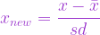
- Normalize or Standardize data
- Impute missing data
- Apply transformations such as a log transformation, or first order difference.
- Apply dimensionality reduction methods such as PCA to decorrelate/summarizes the features
- Plot the data and explore trends
- Test hypothesizes with the data

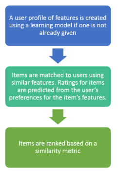 The user profile is typically based on historic user data to build a functional relationship representing how a user would rate a certain item.
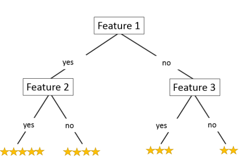
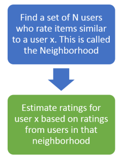 Cosine similarity or Pearson correlation are used to measure similarity between two users, and create the neighborhood of N users.


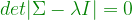
 . The high dimensional data is summarized using orthogonal transformations into uncorrelated principal components.
 . The
. The  entry of
 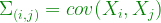 .
.
 .
. of
of 
 matrix
  used as a transformation matrix on the features to create a set of new features from the data.
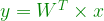
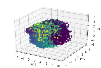
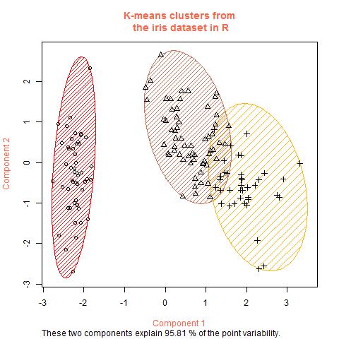
 ). The algorithm divides the data into that number of clusters, and then iterates until it converges to the ideal content in the
  items into
  clusters called
  , where
  . An item can only belong to one cluster, so the clusters are disjoint. Each item
  has a vector of features
  ,
, 
 .
.